Please Note: For Maximum Quality please enlarge player and watch in HD 720p.
Thursday, 7 March 2013
Music Magazine Evaluation Ques#7. Looking back at my preliminary task, what have I learned in the progression from it to the Music Magazine?
I have provided a youtube video which addresses this question in depth in relation to the development from the Preliminary task to the Music Magazine.
Please Note: For Maximum Quality please enlarge player and watch in HD 720p.
Please Note: For Maximum Quality please enlarge player and watch in HD 720p.
Music Magazine Evaluation Ques#6. What have I learnt about technologies from the process of constructing this product?
Below I have provided a youtube video which answers this question 'in depth' highlighting the key information and address media terminology with the use of imagery and audio.
Please Note: For Maximum Quality please enlarge the player and watch in HD 720p.
Please Note: For Maximum Quality please enlarge the player and watch in HD 720p.
Music Magazine Evaluation Ques#5. How did I attract/address my audience?
My Magazine addresses the needs of its focus groups by featuring Hip-Hop music artists and information about the Music Industry. I have come to find that the majority of these artists that represent the Genre are between the ages of 16 and 34, considering the fact that my magazine focuses on very similar age groups 16-28 which means that my focus groups can relate to these artists I will be featuring according to the study of Psychographics.
My magazine also addresses the needs of its focus groups by being a newsweekly publication, which frequent enough to keep people updated on events surrounding the music industry. This is important because the contemporary music industry today is exploding with activity and people want want to be updated; they want to stay ahead of things and know what's going on in the Media industry.
The reason for this is because of the Uses and Gratifications
theory, people use the Media to escape from their everyday problems and because of the way society has deemed certain practices to be acceptable, people find the need relate their lives with the lives of these artists, that's why Media sells. It's a common thing and totally relatable among peers.
Music Magazine Evaluation Ques#3. What kind of media institution might distribute my media product and why?
Looking at existing Hip-Hop magazines I think my JAMZ magazine would be published by IPC Media. The reason for that is because my magazine features both music artists and focuses on audiences predominantly in the United Kingdom. IPC Media is a 'British' consumer publications company; it publishes magazines for companies like NME, which is one of the biggest music publishing names in the United Kingdom as it has the biggest standalone music site in the world (NME.com). NME Magazine focuses on age groups between 15-34 and with the majority of readership being male (66%) and female (34%). According to my research on Psychographics this would put my magazine in a good position to be published by IPC Media since my magazine focuses on similar statistics (Readership age: 16-28), 80% Male, 20% Female.
One slight difference with my magazine and NME is that NME features Alternative and Rock/Indie type Artists and Music contrasting with the Hip-Hop Artists/Music in my JAMZ magazine. I think this would be a great benefit for IPC Media as there are not many artists that represent the Hip-Hop Genre in the United Kingdom when compared to the United States. With the now defunct Hip-Hop Connection magazine which was the biggest name in the UK, solely dedicated to Hip-Hop music, there aren't almost any publications left to help support the Hip-Hop Music Genre and the artists that represent it. Even though NME features well known Hip-Hop artists like Tinie Tempah, it is not 'entirely' dedicated to Hip-Hop as it is predominantly Indie/Rock. This would be a great opportunity for IPC Media because Hip-Hop enthusiasts and other fans aren't being updated in the United Kingdom as efficiently as the US is. As I said before, these young audiences want to stay up to date with current affairs; they want to stay updated and know what's happening in the world of media. My JAMZ Magazine will be published weekly, which is quick enough to keep these young audiences up to date at a reasonable price of £2.50 which should cover publishing and printing costs.
Lastly the need for a new Hip-Hop Magazine in the UK is a must, considering the fact are no major magazines solely dedicated to 'Hip-Hop' left, it would put my Magazine in a stable position with no major competitors, which means good news for IPC.
Tuesday, 5 March 2013
Music Magazine Evaluation (Questions #2 & #4)
The information I have provided below based on my knowledge answers the following questions:
-How does your media product represent particular social groups? (Question#2)
-Who might be the audience for your media product? (Question #4)
Hip-hop is one of the most popular music Genres today. My media product represents young adults and teenagers typically between ages 16-28. There are several artists who represent the Genre that fall within that same age boundary, this means the young people (audience) can relate to them. After having a look at Maslow's Hierachy of needs, Uses & Grafications and Stereotypes it was found that young adults as well as other groups use the Media to escape from their problems and satisfy their needs.
As humans, we have a need to be accepted, we want to be loved and cared for and so these young people grasp on to something that they can relate to and be a part of. My JAMZ Music Magazine will focus on ages typically between 16-28, 80% male and 20% female. The reason for this is because I have come to find out that females aren't as interested in Hip-hop as men because it has been found to be more of a male type Genre. Considering the fact that there are more male artists than female artists in the Hip-Hop. Furthermore, Hip-Hop have been stereotyped to be a negative genre because many artists that represent it promote music that encourages exploitation of female sexuality, violence, drugs etc. A reason for this massive difference in hip-hop being more popular with male than female audiences may be the stereotypical presumption that females are more ''sensitive/emotional'' but the more mature of the two sexes.
Lastly, a lot of young people (mostly males) have found Hip-Hop to be a very interesting Genre due to the lyrical style and creative nature. Hip-hop involves a lot of rhyming which is like poetry and a lot of the things said in the songs can create excitement. Which is one of the main reasons why these young people are attracted to the Hip-hop. There are a number of events circulating the lives of the celebrities and this has been a great point of interest in Contemporary media. As mentioned before, these young people want to have a sense of belonging and so they observe the lives of the celebrities as they can relate to them with their friends.
Below I've provided a 2 youtube videos in response to the questions which highlights important key areas such as Demographics, the Social Economic Table and Stereotypes in relation to Music.
Please Note: Watch both videos in HD 720p for Maximum Quality and Resolution.
This Video Here gives a direct response in relation to question #2 on Stereotypes in relation to music.
This Video below is a Videod focus group I did for my JAMZ Magazine in relation to question #4.
Tuesday, 26 February 2013
Evaluation Question #1. What ways my media product use, develop or challenge forms of conventions of real media products?

In my JAMZ magazine I featured my artist on the Front Cover, Contents and DP Spread, doing such is important as it matches conventions as seen on existing products, introducing chronology in the product.
Another key
thing I did was that I placed my artist's feature story on a pages 7-8, somewhere not too far in the magazine. Doing so enables the reader or audience to identify the artists' story almost instantly. This makes sense because looking at most existing magazines it makes you wonder why is it important and why do they do it? It's because if you feature an artist or band on the front cover of a
magazine, as a producer you want to relay that information to the reader immediately, because the eye catching Front Cover already grasped their attention and they (reader) want to find out more information on that artist or band.
Furthermore, I used not more
than 3 different colours or font styles throughout my magazine which were Red,
Green and a light blue/violet which you can see on my FC and Contents Page. This
again matches conventions of existing products. This is also good because it makes your layout cosistent and looking at most existing music magazines I have found out that they create a ‘house
style.’ Every
magazine is unique and since various companies produce certain magazines, they give
a distinct look to themselves by using specific colour and text.
Continuity is
even more prominent when you look at all 3 pages because I have placed my
distinctive ‘JAMZ’ logo on the FC as the Masthead; the contents page to the top
right and the DP spread to the bottom right, next to the page number.
CONVENTIONS ANALYSIS
(JAMZ MAGAZINE)
Front Cover
(JAMZ MAGAZINE)
Front Cover

Contents Page

DP Spread

Friday, 22 February 2013
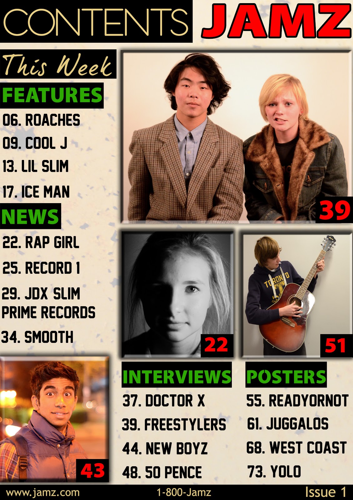
Contents Page (FINAL)

Here I present the final version of my contents page. After carefully reviewing the feedback I received from my peers and teachers I discovered that the images I previously used didn't suit the genre which I was representing. A hip-hop magazine would normally feature 'rap' artists and we know rap artists have been stereotyped to wear hoodies, hats, jewelry etc. Furthermore, I even gave the background a colour scheme to bring some life on the page as the previous one was just plain and boring.
Tuesday, 19 February 2013
My Remarks from Teachers/Peer Feedback
http://www.educreations.com/lesson/view/jeff-agenor/5011019/?ref=link
After looking at feedback I received from my teacher and peers on my contents page it is clear that this is the main problem area that I need to work on:
-The images, as some of them do not quite fit the genre which I am representing, making the magazine lack continuity.
Now I am ready to produce the final draft for my contents page and what I will be doing is using imagery which suit the genre (hip-hop). To make it more releastic, Instead of having a person holding a guitar and dressed like they're indy/rock stars I would dress my models in the same style of clothing which rappers normally wear.
Peer Feedback
Positives:
- The simplistic design makes it look very professional, it could pass for a real contents page of a music magazine
- The pictures are very striking and suit the page very well
- The text fonts suit the overall design of the contents page, making it look more professional
- There are too many colours used (black, white, yellow, green, red). And a lot of these colours clash with each other, especially the green and red.
Feedback
Claudia Neal:
I really like the colours you have used, the greens and reds stand out well. You have kept it simple but effective. Although to improve I think you could have wrote something under the images, and maybe extended on the other headings, by adding more to it (interviews & posters) Furthermore you could changed some of your images to fit the genre more, for example instaed of having someone playing guitar, have someone rapping into a microphone. Overall i think its a really good contents page and you have created it well.
I really like the colours you have used, the greens and reds stand out well. You have kept it simple but effective. Although to improve I think you could have wrote something under the images, and maybe extended on the other headings, by adding more to it (interviews & posters) Furthermore you could changed some of your images to fit the genre more, for example instaed of having someone playing guitar, have someone rapping into a microphone. Overall i think its a really good contents page and you have created it well.
Monday, 4 February 2013
DP Spread FINAL (Version #4)

After revising my previous draft I thought it would be good if i dimmed the Pound note on the rapper's face as it looked like a piece of cardboard and not money. I also made a few more minor touches like moving text around and re-aligning columns and I also gave the pullquote colour to make the page a bit more interesting.
Previous draft (#3)

Wednesday, 30 January 2013
DP Spread Draft #3

Here I present my 3rd draft for my Double page spread. Using pre-existing dp spreads for music magazines I was able to arrange my page in such a way that it actually looks like one by carefully following conventions. I thought it would be conventional to use the colours red and green on my DP spread since I'm using them on both the front cover and contents page. When we compare this new draft to my previous one It is a lot better in terms of style and arrangement; I justified the article to give the columns a much cleaner look and added in the other missing conventions to give it that realistic feel.
Previous draft (#2)

Monday, 28 January 2013
DP Spread (Draft #2)

I present to you my 2nd Draft for my Double Page spread, in this one I have inserted my feature story. When compared to the previous draft we can now see that it is looking a lot more like an actual double page spread. It is not yet complete though as there's still a lot more work to be done before its finalized.
Previous Draft (#1)
.jpg)
Thursday, 24 January 2013
FINAL CONTENTS PAGE

The only notable change that I made is in the 'NEWS' section as it wasn't conventional to just list names of the artists and not say something briefly about them. To the bottom of the contents page I capitalized the contact information as I found it to be conventional on pre existing products. The last thing I did was move around the images and other conventions; in millimeters, making slight adjustments.
Previous Draft (#3)
Tuesday, 22 January 2013
FINAL FRONT COVER

After weeks of drafting; experimenting with font style, layout, imagery and colour I finally came to a conclusion with my music magazine's cover. It boasts a big red Masthead 'JAMZ' which is something you just cannot miss because it has an authoritative approach. Everything sits really well and the elements work great with eachother. There's no dramatic change to this final one when compared to the previous draft; I only tweaked up what was necessary by making slight movements to text and changing the date.
Monday, 21 January 2013
Draft #3 (CONTENTS)

After a few minor adjustments to the previous draft I can now say that I am pretty much wrapping up this contents page and on my way of producing the final draft. Here I have my Second (3rd) Draft for my contents page; as you can see I have put a lot more work into my contents by adding the remaining conventions under the News, Interview, Features and Poster sections. I tried experimenting different font styles, orientation, imaging and colour schemes. I thought it would be necessary to use green and red since those colours are currently being used on my front cover; both colours work nicely together since they are complimentary on the colour wheel. Furthermore it makes even more sense because it shows continuity.
Previous Draft (#2)
.jpg)
Sunday, 13 January 2013
Draft #2 (CONTENTS PG.)
.jpg)
Previous Draft (#1)

Here I have my Second (2nd) Draft for my contents page; as you can see I have put a lot more thought into my contents by experimenting different font styles, orientation, imaging and colour schemes. By researching and following conventions from pre existing products I was able to come up with something genuine but very conventional in a way.
Friday, 11 January 2013
Revamp of FINAL FC (Latest Draft)

Previous Draft

After Careful Consideration and listening to feedback I received from peers and teachers, I decide to enhance my final cover even further. When compared to the previous update, things seemed to be a bit unbalanced in a way as the Red Masthead was just too big and dominated the top of the FC giving it this heavy feel. The magazine's other conventions were predominantly green, this scheme seemed to take over the magazine in a way so I introduced red to them, balancing the FC out even more. Introducing a skyline and footer gave the FC a 'finished' 'clean' feel; now it looks even more like a sellable product. Lastly, I always felt that the background was a little too plain so I introduced the photo of a brick wall which I took; changing the blending modes I created this stylistic, textured look.
Tuesday, 8 January 2013
Overall Impressions of Peer feedback
First thing I can say is that I can see that my peers are really observant and I am pleased with their comments. The reviews are a bit mixed, which is good because it shows that they have a keen eye for criticism. Criticism is good, especially when it is constructive because it allows room for imrovement. I never considered trying to add a skyline for my front cover but I think I will try adding one and see how it works out. Other than that I will just continue to make improvements where necessary; staying on top of my coursework and doing the best I can to get my best possible grade.
Ben Naylorl: JEFF, you're blog is well gee brahh. Looks brilliant, everything is done to an exceptional standard and through your dedication to succeed, your blod reflects this manner. Everything looks so neat and tidy and allows people to clearly see the standard of your work.
Your front cover is actually awesome. Not even joking. All the colours are used excellently to comspire against the constrasting background and it makes it look awesome!!!
Your front cover is actually awesome. Not even joking. All the colours are used excellently to comspire against the constrasting background and it makes it look awesome!!!
Peer Feedback
Charlotte Medhurst
There is a lot of good detailed work and you've explained your process for changing each draft well.
I think its a good front cover picture and I like the effect youve used to enhance the colours on the watch and the sunglasses, its attention grabbing and fits in well with the colour scheme. I also like the masthead, its bold and draws attention to it well.
I think the words 'Say What' should be in the same font as the rest of the lettering on the cover though, as it doesnt look quite right in a different font.
Also, I think you could try putting in a skyline as the top looks a little bare.
And on the picture, theres a shadow on his neck which looks a little odd. It kind of makes it look like his head has been photo shopped onto the body.
Peer Assesment
Emily Devlin
My overall assesment of your bloog is positive. I like your layout, it is clear and the work is good. It shows how much time and effort you put into this subject. I like your front cover as the photo and colour scheme compliment each other very well and your feature titles are attention grabbing without being pver the top. My only criticisms of your front cover would be that I think your masthead is a bit too big and takes up too much space and maybe you could of added a skyline or a footer too? In conclusion I think it is very well presented and you have clearly stuck to the classic conventions of a front cover.
My overall assesment of your bloog is positive. I like your layout, it is clear and the work is good. It shows how much time and effort you put into this subject. I like your front cover as the photo and colour scheme compliment each other very well and your feature titles are attention grabbing without being pver the top. My only criticisms of your front cover would be that I think your masthead is a bit too big and takes up too much space and maybe you could of added a skyline or a footer too? In conclusion I think it is very well presented and you have clearly stuck to the classic conventions of a front cover.
Blogger Feedback
Claudia Neal:
Very well presented and had lots of information. You have explaned everything what you have posted in detail which is good. This has made me think about writting more for everything i post.
For your front cover i found it bold and eye catching and this is from the different colours, texts and the imagery you used.
A critisism of your final cover would be by having the main image in colour, because the background colour and the main image are slightly around the same colour.
Subscribe to:
Posts (Atom)