COLLEGE MAGAZINE PROJECT
(EVALUATION)- Jeff Agenor
Prior to
commencing planning and research for this task, we were given an introductory insight
on the conventions of a magazine cover. We were then instructed to research a few
music magazines and analyze the front cover of one, taking these conventions
into account. By doing this it allowed us to get a much broader understanding
of these conventions; what are they; when are they used and why are they used. Now
that we had a much better understanding of these conventions we were given a
list of things that we had to complete and upload to our blog/moodle by due
day.
For the first task
we had to do another analysis on the front cover of a magazine and contents
page, this time applying 'LIIAR' to it. For this aspect of the project, I had
began an analysis on a gaming magazine cover which featured a character from one
of the world's most popular video gaming franchise' 'Halo' as the main image.
Halfway through the 'Language' aspect of the analysis I had began encountering
difficulties due to limited amount of information on the front cover and the
usage of a Sci-Fi character. I then chose a Billboard magazine cover instead
because I thought it would be much easier to analyze something with more
verisimilitude; as there was much more to talk about. When I compared both
covers I discovered that the character on the gaming magazine didn't have any
life, no emotional expression and limited content. On the Billboard magazine
the model was exploding with life and had a serious expression which gave me an
idea of what type of person he was. He also dressed in black and the usage of a
black background would suggest that he is a person that is very dark in nature.
I can't justify the fact that there is a lot more to talk about on a music
magazine, that's an opinion but I find it much easier to describe when compared
to a gaming one due to its realism.
I had already
began taking images of various locations around the school during the same week
we were given the list of objectives and then editing them on Photoshop. Last
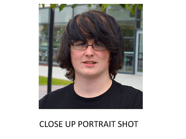
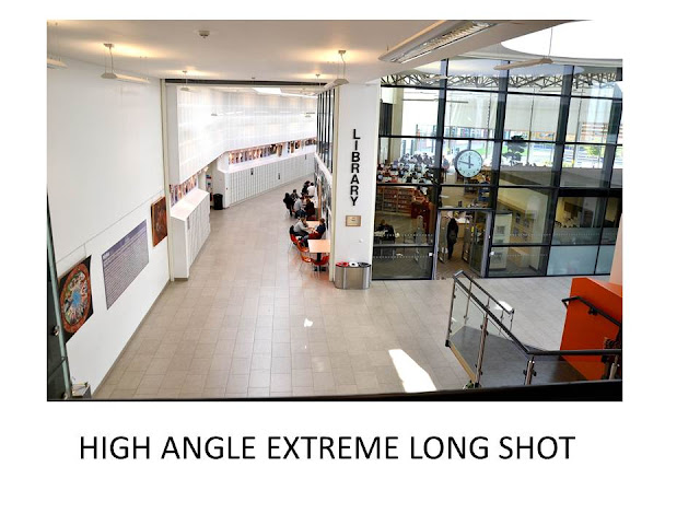
week I took a series of other photographs depicting the various types of
framing and stayed back for 2 hours everyday after school to complete most of
the remaining work. By Friday the LIIAR analysis for Front Cover and Contents
Page; Mockups for both pages; Original Images and Spider Diagram were done. A
Mood board which I had constructed earlier that week assisted me, in terms of
getting my inspiration for my college magazine. Considering everything that I
had learned earlier about the conventions and their importance, along with my
experience in Photoshop I was able to produce my magazine cover in less than an
hour. Ironically, it seemed difficult at the start when the truth is all it was
is placing text over an image but it's how you use it and why.
The background
image features myself and a classmate; both of us look appealing as we're smartly
dressed and wearing a smile. These are important and must be taken into account
as smiling sends an invitation to a friendly atmosphere. Smiling gives
assurance and make us feel happy; when we're happy what we feel is acceptance;
nobody wants to feel left out. We're also dressed smart; the waist coat;
necktie; and non detracting colours blue, black
and white; and the books demonstrate professionalism. Most people would want to
attend somewhere like this because we only want the best. 'College Life' which
is the name of the magazine published by the school I named 'Modern Institutes'
is vibrantly displayed at the top. I chose blue because I didn't want too many
different colours (considering the fact that my dress shirt
is blue) and the white lockers in the background creates good contrast making
it stand out. Another factor I took into consideration was that orange is the
complimentary (opposite) colour of blue on the
colour wheel. They look good against each other and using both colours on the cover stories, taglines and pull quotes
create balance. In Graphics it is important to bear in mind the elements and
principles of art as they are what is used as foundations and guidelines when
producing a product. However rules can sometimes be broken although it is wise
to consider them.
Furthermore, what
I learnt about college magazines is that they are of great importance due to
the fact that they were designed to relay an immense deal of information to a
variety of audiences, fast. They outline specific details of the college
itself, services it offers, its students or events held by the institution. They
are beneficial because they are one of the means by which students can be given
a freedom of speech; expressing their views and ideas and it is a great way to
acknowledge them for their accomplishments. When I was coming up with taglines
and pull quotes to include on my college magazine cover, I asked myself 'what
is the purpose of a college magazine and what do you normally find on the
cover?' I used these lines: 'Thunders
win by 40' as a good way of acknowledging students for their achievements. 'Skeptic? speak to one of our members of
the counselling team, we're happy to help' -
As mentioned before,
college magazines are known for relaying important information. '5 things you need to know' is used as
a teaser, a way of gaining audience's attention to purchase the magazine.
The back image on
my front cover was really bright especially the white lockers and the tones
were hurting my eyes so I gave it a 'cooling' filter on Photoshop to neutralize
the hues and by doing that it gave it a much softer, greyish, less detracting look. I decided not to use a picture of a
barcode off the internet which is what most persons would normally do but
rather, use a barcode font which I had downloaded from a website earlier this
year to create my own. This is why the analysis we had to do on the existing
products (college magazines) and everything else that we did in the beginning
was important as I was able to cross reference that information with my
magazine cover.
The greatest
challenge I faced during the preparation of this project was in the last 2
weeks as I'm currently enrolled on 2 other A level subjects 'Graphic Design'
and 'Photography.' Both with loads of coursework and there was a point where I
was bombarded and had so much to complete in a limited amount of time. So I
rectified this by taking 2 hours out of my schedule everyday after to school
and making use of my study periods to complete as much as I can. Eventually it
paid as everything became balanced; I
felt as if I was in control again and it made me gain an understanding on the
importance of effective time management, organisation and planning.
.jpg)
1.jpg)


.jpg)


+JEFF+AGENOR.jpg)
-+Jeff+Agenor.jpg)
-+Jeff+Agenor.jpg)
