http://www.educreations.com/lesson/view/jeff-agenor/5011019/?ref=link
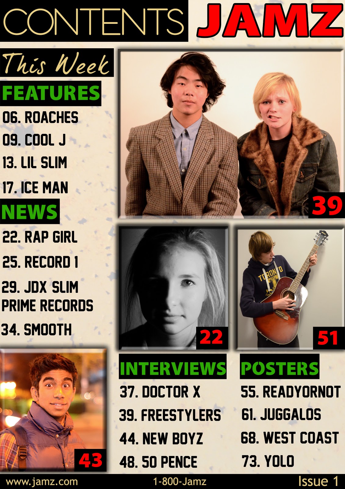
After looking at feedback I received from my teacher and peers on my contents page it is clear that this is the main problem area that I need to work on:
-The images, as some of them do not quite fit the genre which I am representing, making the magazine lack continuity.
Now I am ready to produce the final draft for my contents page and what I will be doing is using imagery which suit the genre (hip-hop). To make it more releastic, Instead of having a person holding a guitar and dressed like they're indy/rock stars I would dress my models in the same style of clothing which rappers normally wear.
Tuesday, 19 February 2013

Peer Feedback
Positives:
- The simplistic design makes it look very professional, it could pass for a real contents page of a music magazine
- The pictures are very striking and suit the page very well
- The text fonts suit the overall design of the contents page, making it look more professional
- There are too many colours used (black, white, yellow, green, red). And a lot of these colours clash with each other, especially the green and red.
Feedback
Claudia Neal:
I really like the colours you have used, the greens and reds stand out well. You have kept it simple but effective. Although to improve I think you could have wrote something under the images, and maybe extended on the other headings, by adding more to it (interviews & posters) Furthermore you could changed some of your images to fit the genre more, for example instaed of having someone playing guitar, have someone rapping into a microphone. Overall i think its a really good contents page and you have created it well.
I really like the colours you have used, the greens and reds stand out well. You have kept it simple but effective. Although to improve I think you could have wrote something under the images, and maybe extended on the other headings, by adding more to it (interviews & posters) Furthermore you could changed some of your images to fit the genre more, for example instaed of having someone playing guitar, have someone rapping into a microphone. Overall i think its a really good contents page and you have created it well.
Monday, 4 February 2013
DP Spread FINAL (Version #4)

After revising my previous draft I thought it would be good if i dimmed the Pound note on the rapper's face as it looked like a piece of cardboard and not money. I also made a few more minor touches like moving text around and re-aligning columns and I also gave the pullquote colour to make the page a bit more interesting.
Previous draft (#3)

Wednesday, 30 January 2013
DP Spread Draft #3

Here I present my 3rd draft for my Double page spread. Using pre-existing dp spreads for music magazines I was able to arrange my page in such a way that it actually looks like one by carefully following conventions. I thought it would be conventional to use the colours red and green on my DP spread since I'm using them on both the front cover and contents page. When we compare this new draft to my previous one It is a lot better in terms of style and arrangement; I justified the article to give the columns a much cleaner look and added in the other missing conventions to give it that realistic feel.
Previous draft (#2)

Monday, 28 January 2013
DP Spread (Draft #2)

I present to you my 2nd Draft for my Double Page spread, in this one I have inserted my feature story. When compared to the previous draft we can now see that it is looking a lot more like an actual double page spread. It is not yet complete though as there's still a lot more work to be done before its finalized.
Previous Draft (#1)
.jpg)
Thursday, 24 January 2013
FINAL CONTENTS PAGE

The only notable change that I made is in the 'NEWS' section as it wasn't conventional to just list names of the artists and not say something briefly about them. To the bottom of the contents page I capitalized the contact information as I found it to be conventional on pre existing products. The last thing I did was move around the images and other conventions; in millimeters, making slight adjustments.
Previous Draft (#3)
Subscribe to:
Posts (Atom)